Creating Bento Grid Layouts
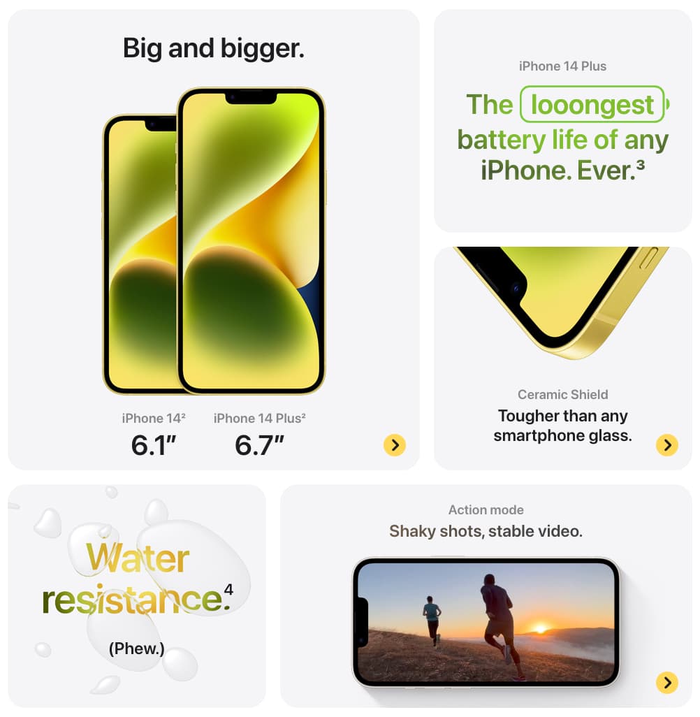
As you browse the web, you've likely come across this type of layout before. It can be called a bento grid layout, bento box layout, or bento box grid. This layout takes its inspiration from the traditional Japanese bento box. 🍱
Bento grids are super versatile, perfect for displaying all sorts of content like images, text, mixed media, and more. They showcase loads of content in a compact and organized way, making your website or app look clean and engaging.
Trends and examples
Some people say that it start with Windows 8 and the metro design.
However, the true trendsetter in recent times is Apple. They've been using bento grid layouts extensively in their video presentations and on their website, making it a popular design choice.


If you're looking for design inspiration you can check bentogrids. It's a curated collection showcasing the best bento grid layouts on the web.
Building a Bento Grid: Step-by-Step Code
There are countless ways to create bento grid layouts, and today, I'll show you some of them using Tailwind CSS and React.
Note that the code examples provided are not responsive by default, as they are intended to be easily viewed on mobile devices too. If you want to make them responsive, you can simply add breakpoints to adjust the layout for different screen sizes.
Using CSS Grid
One approach to building a bento grid is using CSS Grid, along with grid-template-columns, grid-auto-rows, and grid-row. Check out this example:
<div className="grid auto-rows-[192px] grid-cols-3 gap-4">
  {[...Array(7)].map((_, i) => (
    <div
      key={i}
      className={`row-span-1 rounded-xl border-2 border-slate-400/10 bg-neutral-100 p-4 dark:bg-neutral-900 ${
        i === 3 || i === 6 ? "col-span-2" : ""
      }`}
    ></div>
  ))}
</div>
We make the 3rd and 6th items span two columns on medium screens and up using the md:col-span-2 utility.
Using CSS Columns
If the order of the items doesn't matter, and if you need it in columns you can opt for a multi-column layout using column-count, column-gap, and margin-bottom on the items.
<div className="columns-1 gap-4">
  {[24, 32, 36, 32, 32, 32, 16, 16, 64].map((height, index) => (
    <div
      key={index}
      className={`mb-4 h-${height} break-inside-avoid rounded-xl border-2 border-slate-400/10 bg-neutral-100 p-4 dark:bg-neutral-900`}
    />
  ))}
</div>
The array contains the height of each card component. Alternatively, you can use a full height and let the children components set the card height.
Using CSS Flexbox
Just like with columns, flexbox is a great option too. You can use flex-wrap, flex-grow, and margin-bottom on the items.
<div className="flex gap-4">
  {[
    [24, 32, 32, 16, 16],
    [32, 40, 56],
    [64, 32, 32],
  ].map((card, index) => (
    <div className="flex-1" key={index}>
      {card.map((height, index) => (
        <div
          className={`mb-4 h-${height} rounded-xl border-2 border-slate-400/10 bg-neutral-100 p-4 dark:bg-neutral-900`}
          key={index}
        ></div>
      ))}
    </div>
  ))}
</div>
The code uses an array to store the heights of the cards in each column. The first element of the array is an array of the heights of the cards in the first column, the second element is an array of the heights of the cards in the second column, and so on. Again, you can use a full height and let the children components set the card height.
More
We've covered some of the most common ways to create a bento grid, but there are loads of other methods depending on your needs.
If you're curisous to learn more, dive into CSS Grid and Flexbox to discover even more possibilities.
--
I'm looking forward to writing more articles covering a range of topics like design, front-end development, software, and more. So, stay tuned!
I'd love to hear your feedback, suggestions, or questions. If you found this article helpful, please consider sharing it with others who might enjoy it too. 🙌 Thanks for reading!
Subscribe for project updates, links, and personal notes.